Quick fast food
Creative Service: Brand Strategy, Logo design & full brand Identity development.
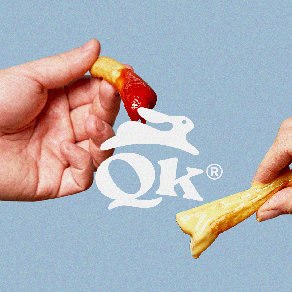
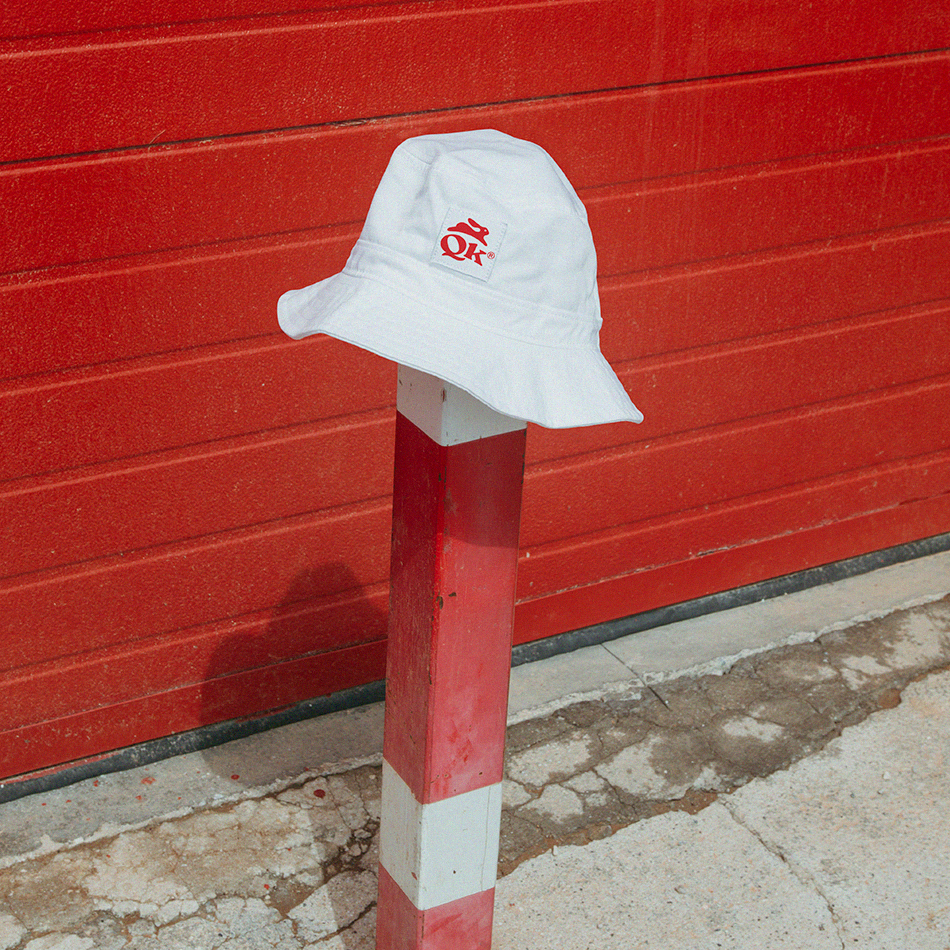
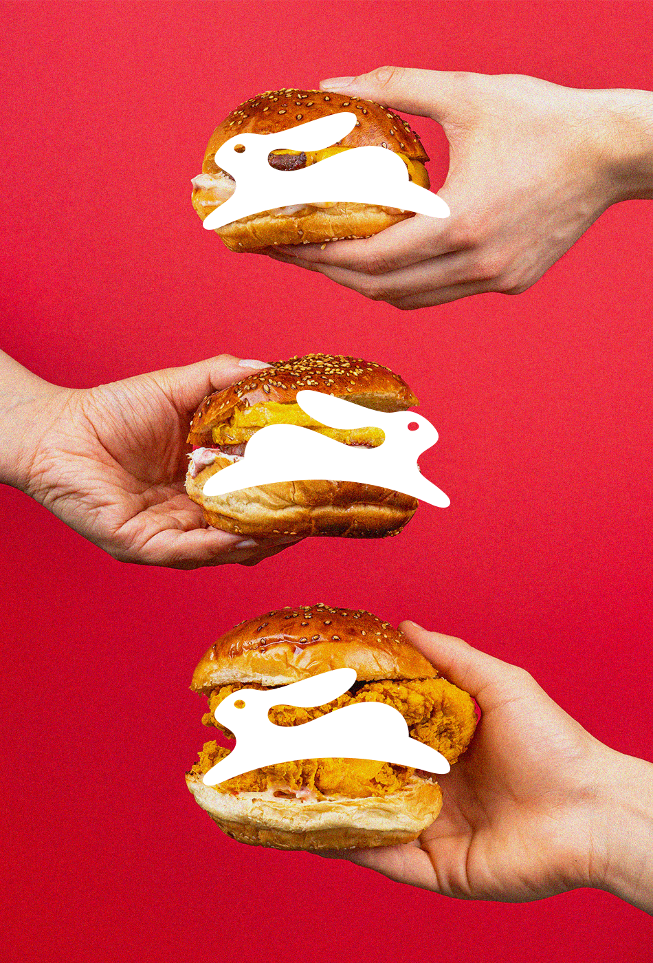
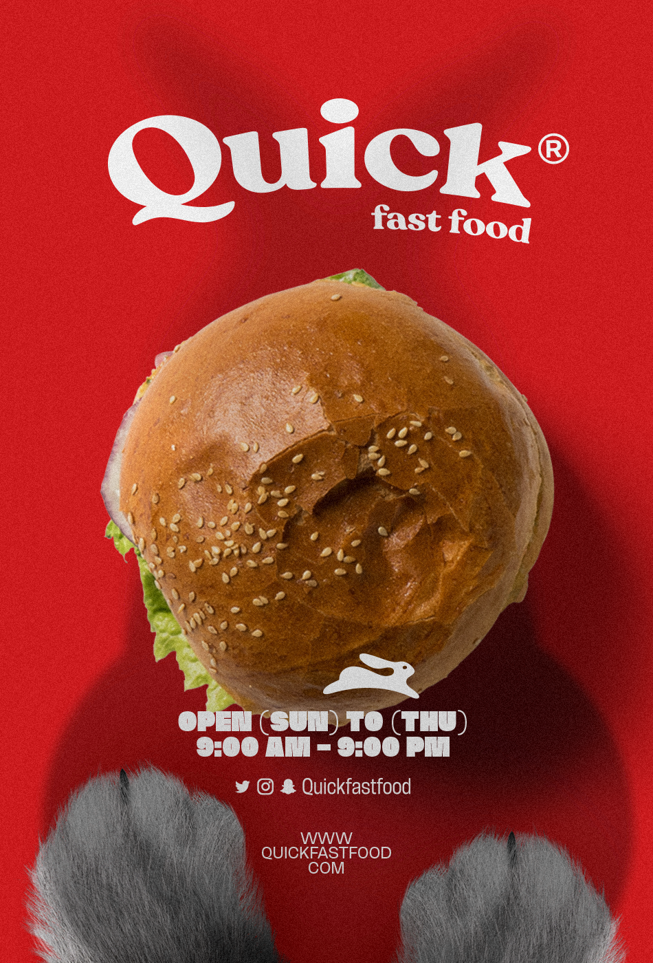
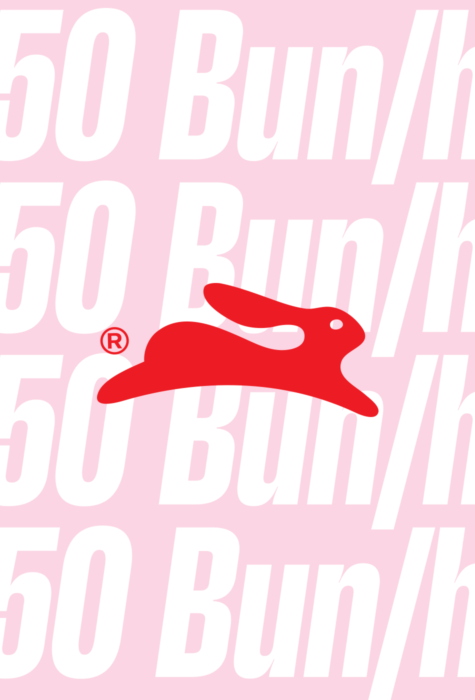
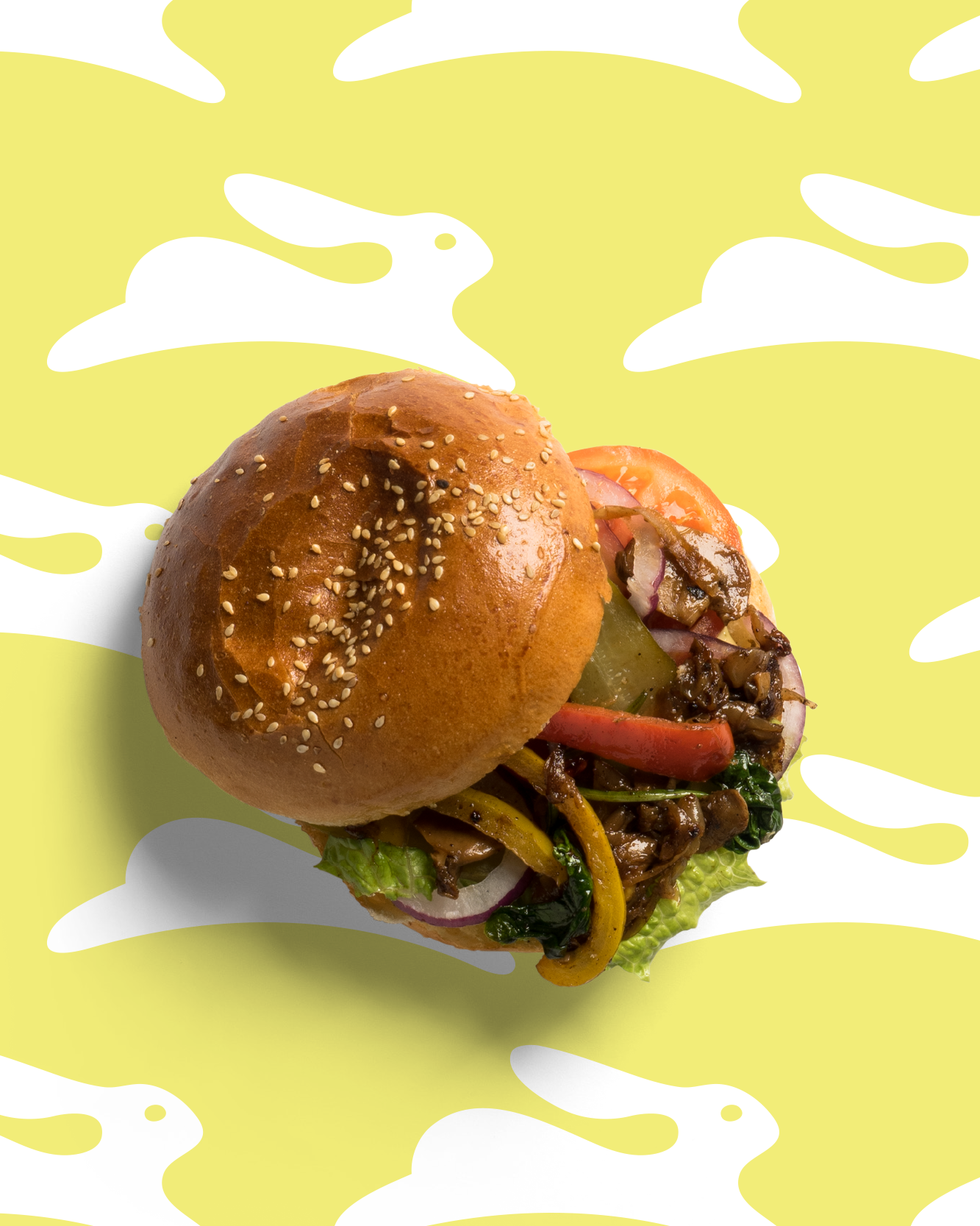
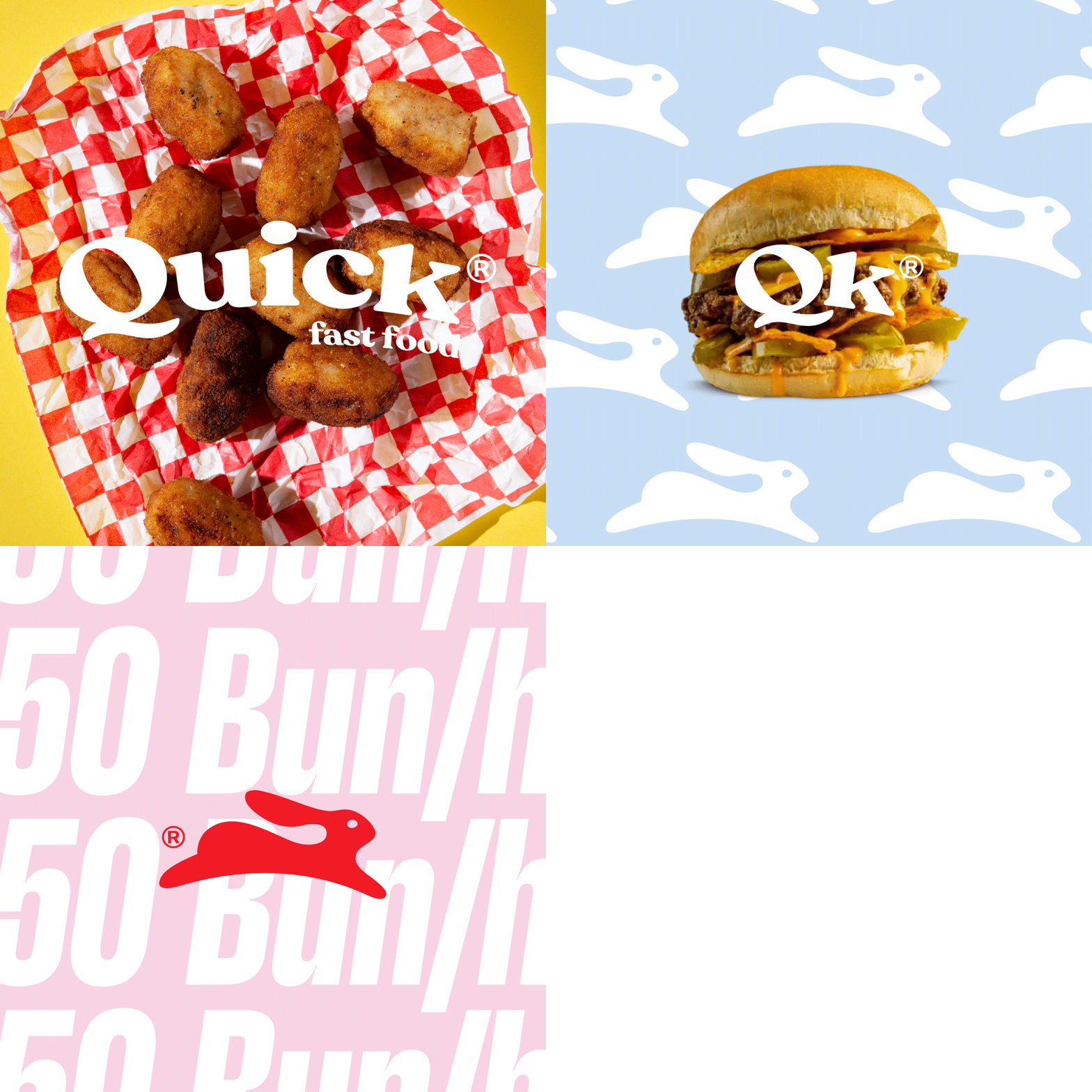
Quick® fast food is a burger joint that emphasizes speed and convenience. The logo design, which is inspired by a running rabbit, reinforces the idea of speed and agility. Rabbits are known for being fast and nimble, and the use of a rabbit in the logo suggests that Quick® fast food is fast, efficient, and always on the go.
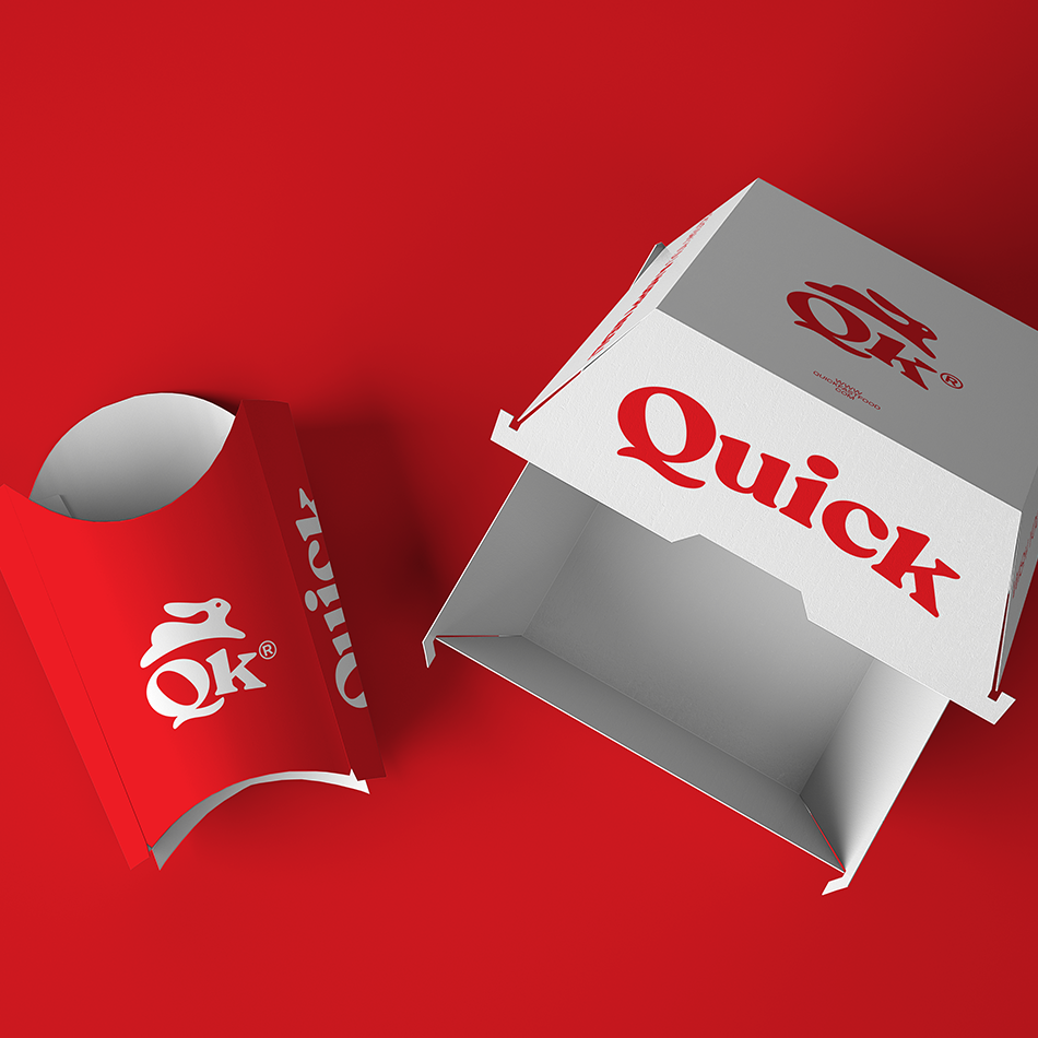
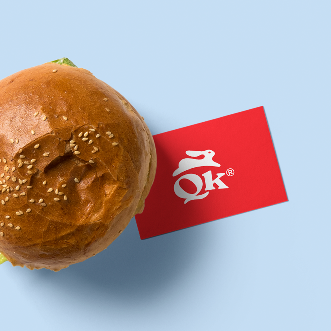
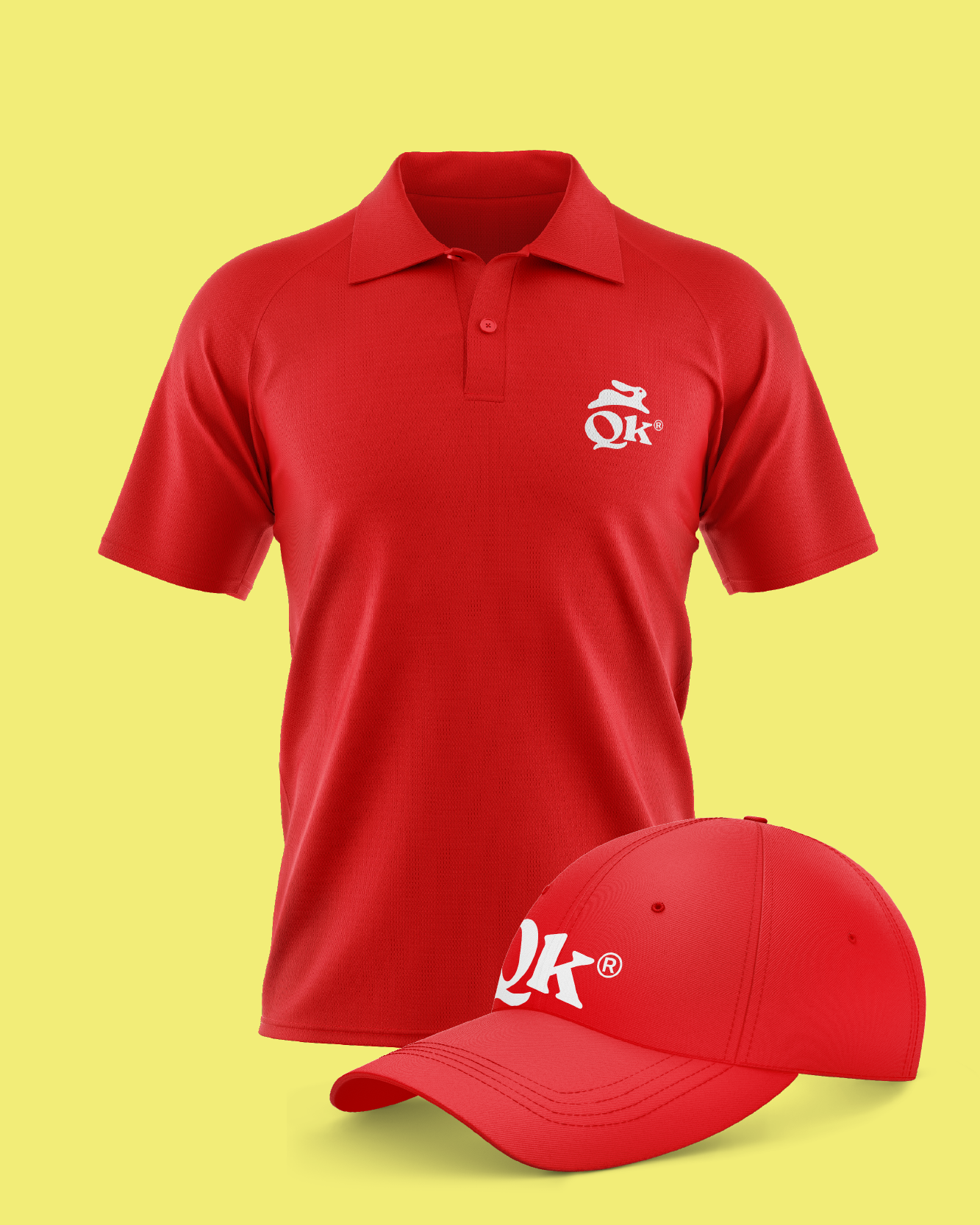
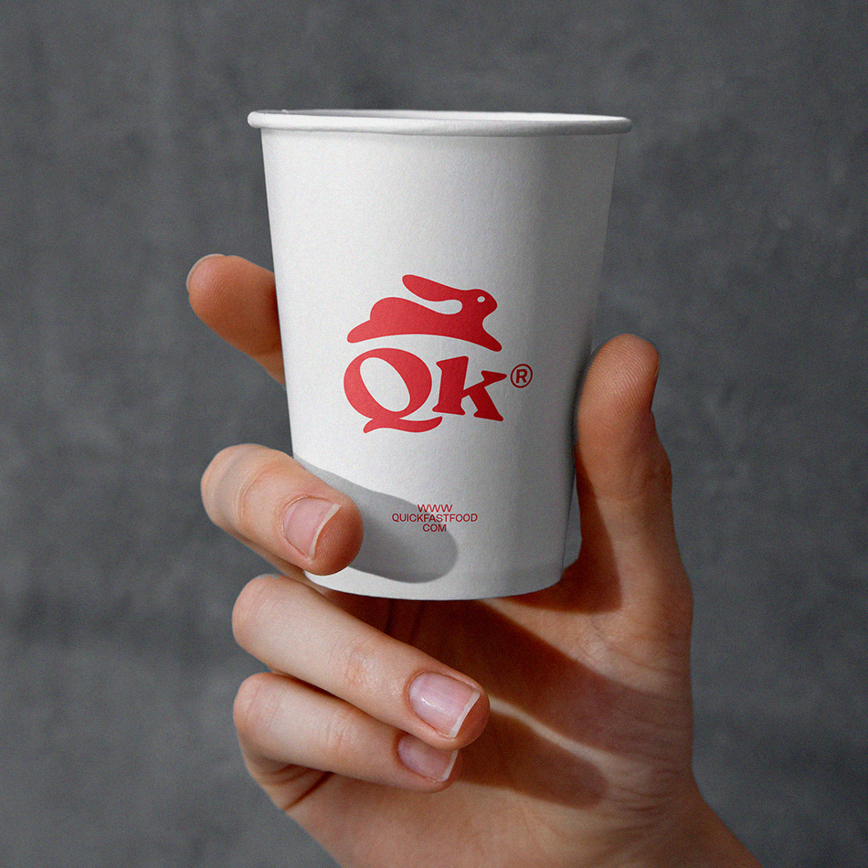
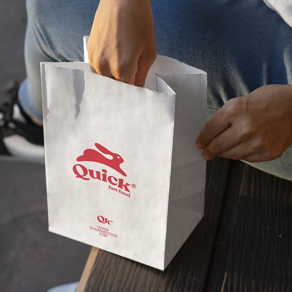
The use of the shortcut "QK" in the logo is a clever way to represent the brand concept. The letters "Q" and "K" are adjacent to each other in the alphabet, which reinforces the idea of speed and quickness. The shortcut also makes the brand name more memorable and easy to recognize.
Overall, the logo design for Quick® fast food is an effective representation of the brand's focus on speed and convenience. The use of a running rabbit and the "QK" shortcut perfectly capture the brand's concept and make it easy for customers to remember and identify.
QUICK FAST FOOD | SA ©2022
© All copyrights reserved
The fact that there is no queue to wait at Quick® fast food reinforces the idea of speed and convenience that is reflected in the logo design. The brand's commitment to providing super fast service is a key part of its appeal to customers who are looking for a quick and satisfying meal on the go.
The lack of a queue also suggests that Quick® fast food is well-organized and efficient, with a streamlined system for taking and fulfilling orders. This can be a major advantage for customers who are looking to grab a quick meal during a busy day, as it means they can get in and out of the restaurant quickly without having to wait in line.
Overall, the fact that there is no queue at Quick® fast food is a testament to the brand's commitment to speed, efficiency, and customer satisfaction. By providing fast and convenient service, Quick® fast food is able to meet the needs of busy customers who are looking for a quick and tasty meal on the go.
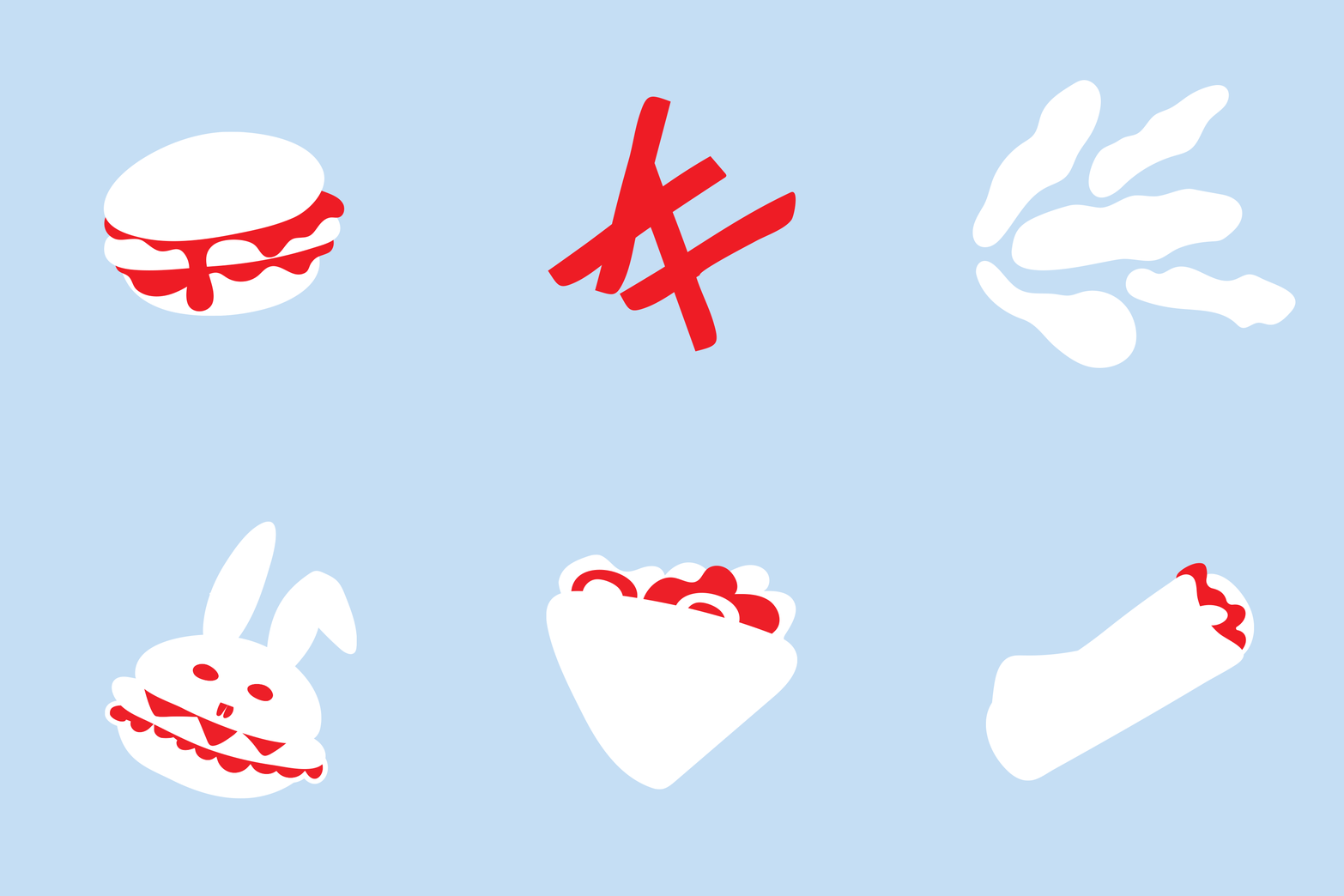
The use of the "QK" shortcut in the logo of Quick® fast food, where the first letter "Q" and the last letter "K" are used to represent the word "Quick," is a clever and effective way to reinforce the brand's focus on speed and efficiency. By canceling the letters in between "Q" and "K," the shortcut emphasizes the idea of cutting out unnecessary steps and getting straight to the point, which is a key part of the brand's appeal to customers who are looking for a quick and convenient meal.
Overall, the "QK" shortcut is a smart and memorable branding element that perfectly captures the essence of the Quick® fast food brand. It is a great example of how a well-designed logo and branding strategy can help to effectively communicate a brand's values and concepts to customers.
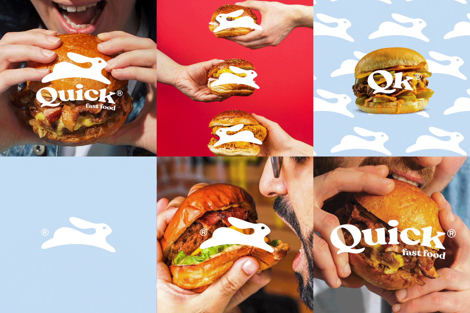
The use of the "QK" shortcut in the logo of Quick® fast food and the icon of a running rabbit both reinforce the brand's focus on speed and efficiency. The "QK" shortcut emphasizes the idea of quickness and cutting out unnecessary steps, while the icon of a running rabbit suggests speed and agility, which are qualities that are highly valued by customers who are looking for a quick and convenient meal.
Together, these branding elements create a cohesive and memorable logo that perfectly captures the essence of the Quick® fast food brand. The combination of the "QK" shortcut and the running rabbit icon suggests a brand that is fast, efficient, and always on the go, which is exactly what customers are looking for when they visit a quick-service restaurant like Quick® fast food.
QK — From Queue to Kitchen
"From Queue to Kitchen" is a catchy and memorable tagline that effectively communicates the brand's focus on speed and efficiency. By emphasizing the idea of going "from queue to kitchen," the tagline suggests that the brand is committed to providing fast and efficient service that gets customers in and out of the restaurant quickly.
The tagline also reinforces the idea of cutting out unnecessary steps and getting straight to the point, which is a key part of the Quick® fast food brand identity. By focusing on speed and efficiency, Quick® fast food is able to meet the needs of busy customers who are looking for a quick and convenient meal.
"From Queue to Kitchen" is a great tagline that perfectly captures the essence of the Quick® fast food brand. It is a strong and memorable branding element that effectively communicates the brand's values and concepts to customers, and helps to differentiate Quick® fast food from other fast food chains.


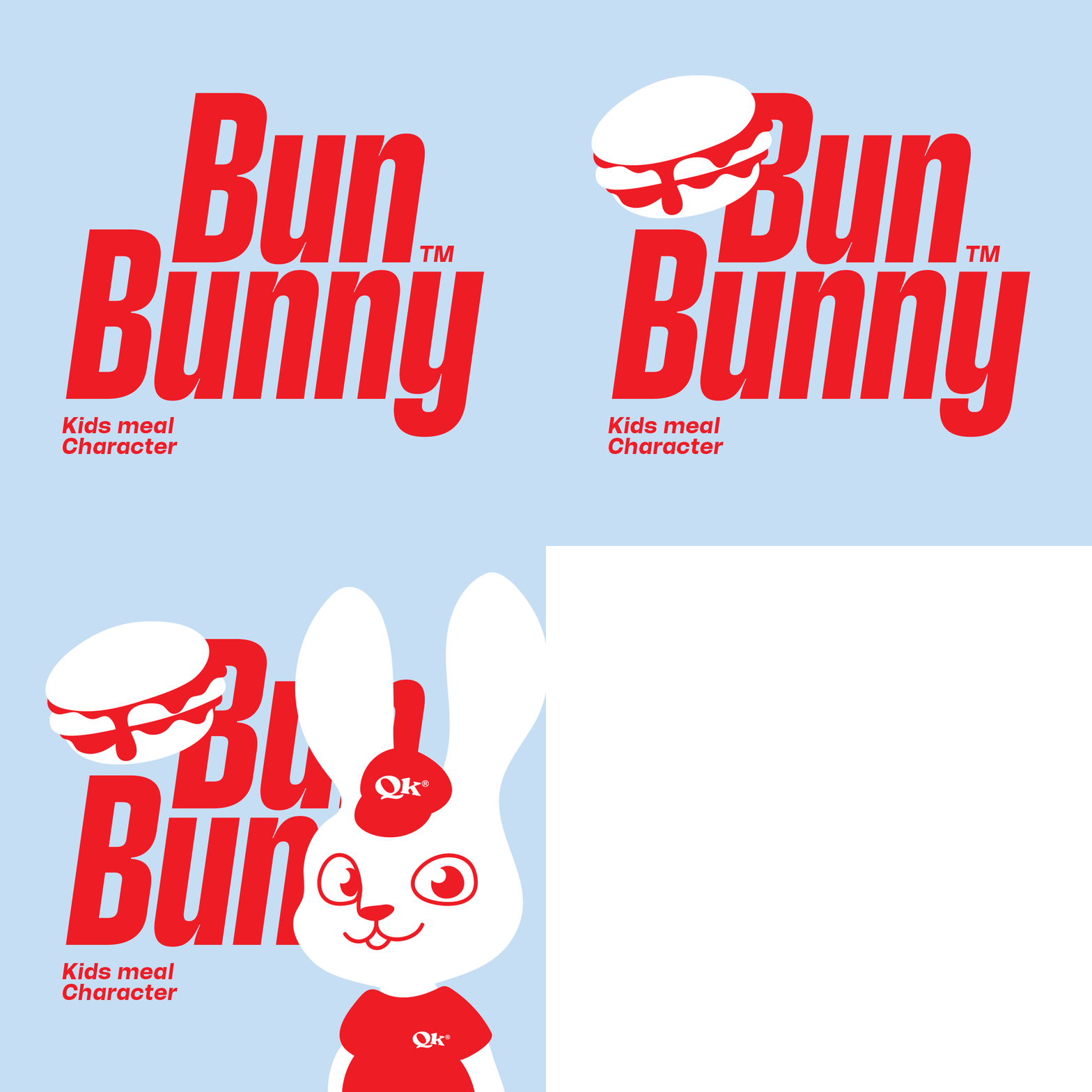
BUN BUNNY
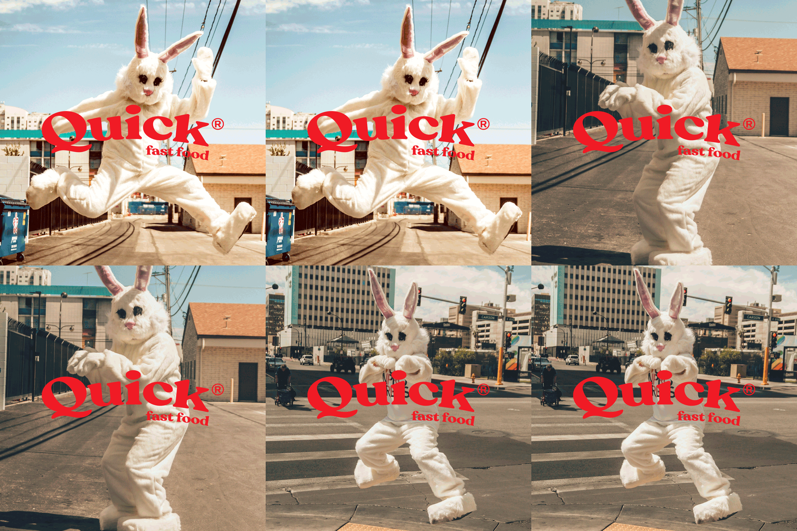
The addition of a character like BUN BUNNY to the Quick® fast food brand is a great way to appeal to kids and families. The use of a cute and playful character like BUN BUNNY can help to create a fun and welcoming atmosphere for children, which can make the dining experience more enjoyable for the whole family.
The addition of a character like BUN BUNNY to the Quick® fast food brand is a great way to appeal to kids and families. The use of a cute and playful character like BUN BUNNY can help to create a fun and welcoming atmosphere for children, which can make the dining experience more enjoyable for the whole family.
Having a dedicated kids meal that features a character like BUN BUNNY can also help to differentiate Quick® fast food from other fast food chains and create a unique selling point that appeals specifically to families with young children. By offering a variety of options and incentives for families, such as a fun character like BUN BUNNY, Quick® fast food is able to expand its customer base and create a loyal following among families with kids.
The addition of a character like BUN BUNNY to the Quick® fast food brand is an effective way to appeal to families with young children and create a fun and welcoming atmosphere for all customers.
